Banks Creative Design System
A warm, strategic design system for turning B2B growth work into something clear, credible, and ready to ship.
Type styles
A compact type system built around expressive editorial headlines, clean supporting copy, and restrained accent labels.
Crimson Pro / 700
Strategy that builds clarity.
Creative that drives growth.
Crimson Pro / 700
Growth systems for the next stage.
Crimson Pro / 700
What we help build
Crimson Pro / 700
Positioning.
Inter / 400
Helping B2B companies clarify their story, strengthen their brand, and build systems that drive growth.
Inter / 400
Banks partners with growth-stage B2B teams to turn strategy into clear messaging, sharper creative, and practical marketing systems.
Inter / 400
Used for captions, metadata, card details, and supporting notes.
Inter / 700 / Uppercase
GROWTH & CREATIVE
Brand palette
A warm, dark, and tactile palette built around study green, cream typography, brass accents, and muted natural materials.
Dark, premium, grounded.
Use deep green and ink backgrounds for hero sections, major brand moments, and high-contrast editorial layouts.
Warm, readable, tactile.
Use cream and muted paper tones for case studies, proposals, documents, cards, and moments that need a more editorial feel.
Small marks. Clear emphasis.
Use brass for CTAs, eyebrow labels, period markers, divider lines, pins, and small moments of emphasis. Keep it restrained.
Calls to action
A restrained button system built around brass accents, clear hierarchy, and small moments of motion.
LINKS & NAVIGATIONNavigation system
Simple, quiet navigation styles built to support the brand without competing with the page content.
This is a sample paragraph with an inline link to selected work and another link to start a project.

Content blocks
Reusable card styles for services, work previews, proof points, and editorial content across the Banks site.
Positioning
Clarify what you do, who it is for, why it matters, and how the market should understand you.
Case studies
Turn client outcomes, customer stories, and campaign results into proof that supports sales and demand.
Campaign systems
Build campaigns, landing pages, creative, and reporting loops that connect strategy to measurable traction.

200+
60%
2x
$95k
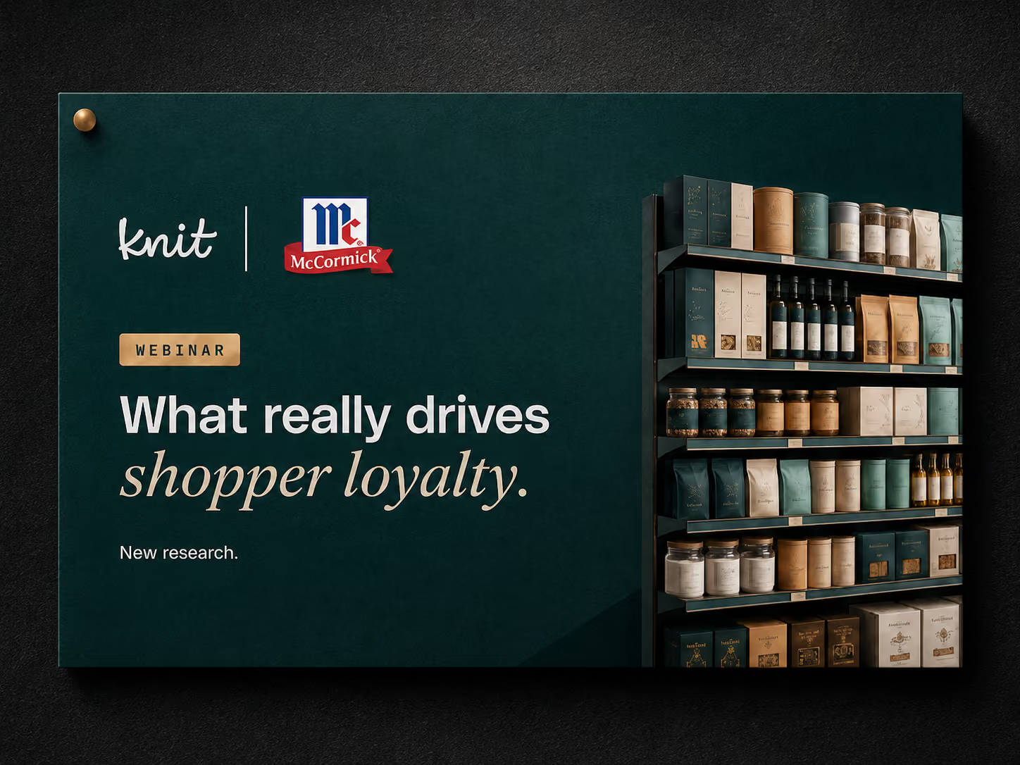
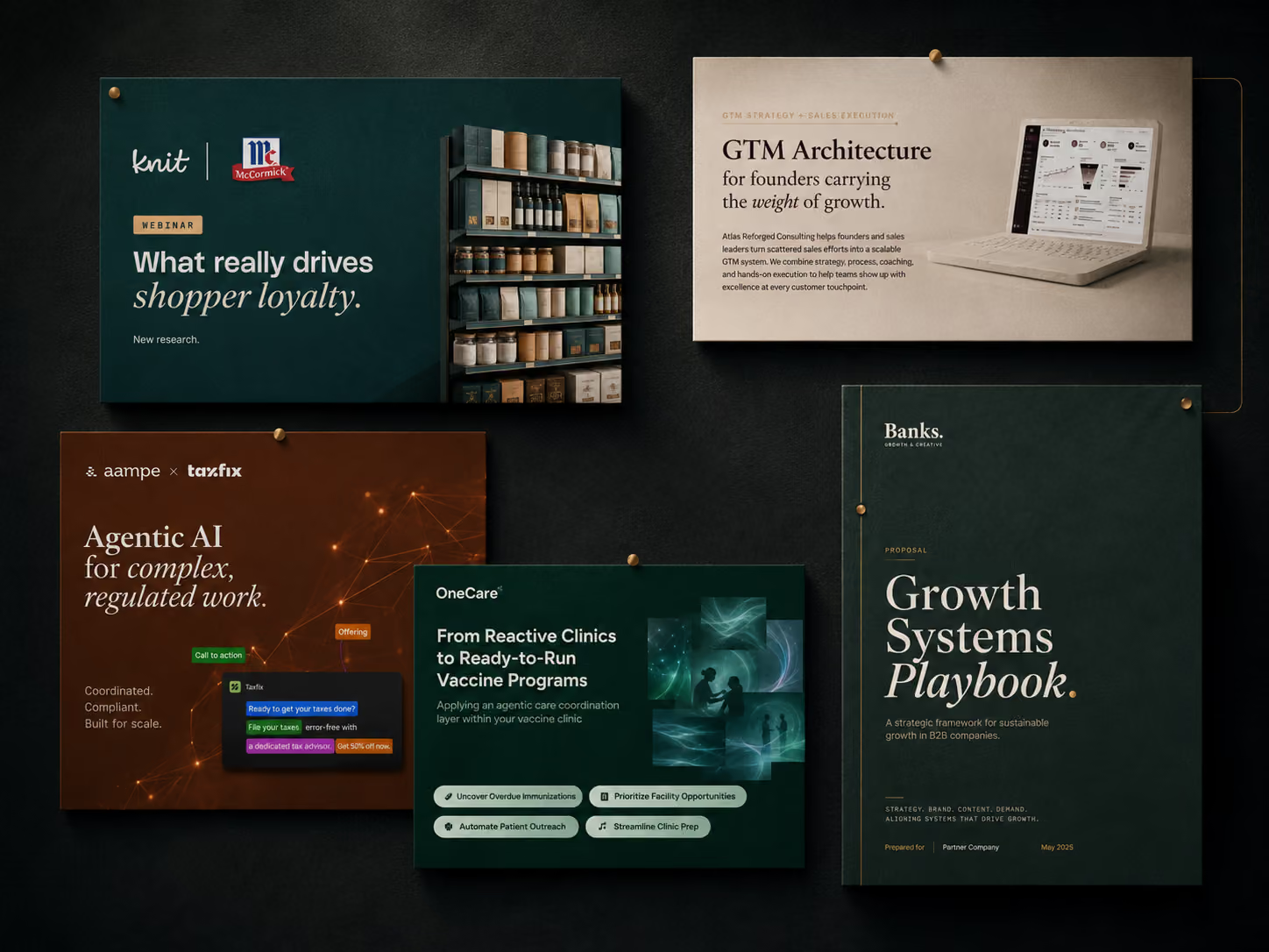
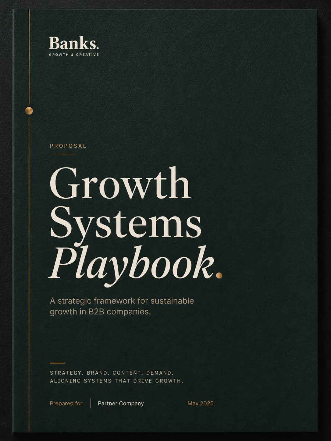
Image treatments
Reusable image styles for portraits, work previews, editorial cards, and dark blended hero compositions.

Texture systems
Reusable background treatments using Banks texture assets, overlays, and restrained editorial surfaces.
Plain sample
Use for case studies, proposal sections, process blocks, and moments that should feel more like paper than UI.
Textured, cinematic, grounded.
Use for hero sections and high-impact brand moments where copy needs contrast and atmosphere.
Warm, tactile, readable.
Use for case studies, proposal sections, process blocks, and moments that should feel more like paper than UI.
A refined backdrop for proof.
Use behind work previews, pinned boards, client artifacts, and selected project sections.
Small moments of emphasis.
Use for narrow bands, detail panels, pinned accents, or premium transition moments. Avoid using it as a full page background.
Brand details
Small visual details that give the Banks system its tactile, editorial, and strategic character.
Contact styles
Simple form elements for project inquiries, contact pages, and lightweight conversion moments.
Start with a conversation.
Use this form style for prospective clients who need help with positioning, growth strategy, creative systems, campaigns, or website work.